Displacement mapping the 2019 Albanian earthquake with Sentinel-1 InSAR
With COVID isolation continuing, I’ve returned to a topic that has interested me for a long time: synthetic aperture radar (SAR), and more specifically SAR interferometry (InSAR). InSAR is a great tool for measuring small ground displacements that can result from earthquakes, landslides, or subsidence into cavities such as those left behind by oil and gas exploration. There are a number of SAR satellites in operation currently, but I’ll be using freely accessible data from the ESA’s Sentinel-1 platform.
As a first toy problem, I decided to look at the site of the earthquake that hit Albania last year on November the 26th. The steps I take are largely based on this ESA tutorial document.
This earthquake hit Albania near the town of Durres, so to start off I chose two SLC data products (S1A IW SLC 1SDV 20191125T164052 20191125T164119 030070 036F2E 4A87 and S1A IW SLC 1SDV 20191207T164051 20191207T164118 030245 03752F F624) from Copernicus Scihub (not to be confused with Sci-hub!) that were acquired on the 25th of November and the 7th of December. Interferometry involves measuring phase differences between pairs of imagery, so we need phase-sensitive single-look complex (SLC) data products rather then the smaller and more processed products often used for SAR imaging.

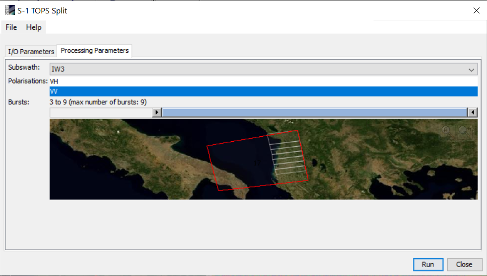
After downloading the two SLC products, I imported both into into ESA’s SNAP toolbox and used the TOPS Split operator to cut down the product to the region and data of interest. We don’t need the VH scattered polarisation for interferometry and we don’t care about Italy or the Adriatic, so I sliced each data product to only include VV-polarised data from bursts 4-9 of subswath IW3, as below.
I then applied orbit corrections to each each product (Radar > Apply Orbit File) and combined the two products into a coregistered stack with back-geocoding using the SRTM 1sec model (Radar > Coregistration > S-1 TOPS Coregistration > S-1 Back Geocoding). I expected this to mask out the zero-elevation sea portion of the imagery, but it didn’t seem to do so. With coregistered data in hand, I was then able to create an interferometric product in SNAP (Radar > Interferometric > Products > Interferogram formation), checking ‘Subtract topographic phase” to remove the influence of static ground geometry. The interferogram produced at this point is very noisy and still contains horizontal bands showing the gaps between the separate bursts collected by S-1, but the fringes of an interference pattern centred on the coast are visible if you squint a little bit.

The next steps are to stitch the different bursts together into a composite (“debursting”; Radar > Sentinel-1 TOPS > S-1 TOPS Deburst), and use a Goldstein filter (Radar > Interferometric > Filtering > Goldstein Phase Filtering) to clean up some of the noise. The image becomes much more clear at this point, although there are still patches of noise. We now have what looks like some decent interferometric data, but converting this into displacement measurements requires the additional step of “unwrapping”. Unwrapping is a computationally expensive process that brings my laptop to its knees for several hours at a time, so I took a subset of the most relevant parts of the image to avoid wasting CPU time processing the boring parts. In hindsight even this subset took an unreasonable amount of time to process and I should have trimmed even more aggressively.
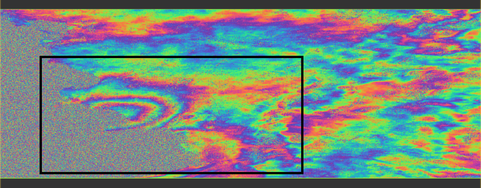
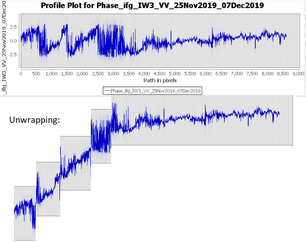
Unwrapping attempts to convert periodic phase measurements into absolute displacement measurements, effectively by working out the boundaries between integer numbers of wavelengths. I’ve tried to illustrate this below with a crude MS Paint slice-up of a line measured from the centre of the concentric phase rings to the top right corner of the subset shown above.
SNAP can’t do phase unwrapping, but it can interface with a utility—snaphu—which does. I can’t seem to get the actual processing to work within SNAP, but was able to export the phase data for unwrapping (Radar > Interferometric > Unwrapping > Snaphu Export) and then run snaphu from the command line on the exported data. This took about five hours wall time to complete on my laptop (Ryzen 3500U), running as 6 CPU threads.
Once the unwrapping has finished, the unwrapped data can be imported into SNAP (Radar > Interferometric > Unwrapping > Snaphu Import) and converted from unwrapped phase information to displacement data (Radar > Interferometric > Products > Phase to Displacement). We now have a displacement map (below), but it’s hard to relate this to on-the ground differences. The major changes in displacement (to the left and bottom) are over the water, probably caused by changing tides, and the imagery is still a satellite-eye view that can’t be directly projected onto terrain.
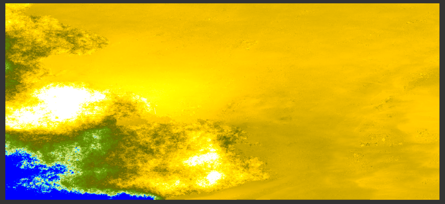
Finally, we can run a range-doppler correction on the displacement map (Radar > Geometric > Terrain Correction > Range-Doppler Terrain Correction) to produce a displacement map of the land area only, scaled to a correct geographic projection. This product can be viewed in SNAP, but for convenience we can export it as a KMZ file and view it in Google Earth superimposed over optical imagery. At this point it’s clear that the unwrapping process has somehow missed the baseline (I suspect that the large area of water might have interfered): the relative changes in displacement look good, but somehow we have the earthquake epicentre set as the location which hasn’t moved, and the rest of the country having dropped by ~10 cm around it. This is clearly incorrect, but I don’t actually know how to re-set the baseline for the displacement band correctly. For a rough estimate I’d add about 9–9.5 cm to the numbers displayed on the legend, suggesting that Hamallaj was lifted by about 11–12 cm following the November earthquake.
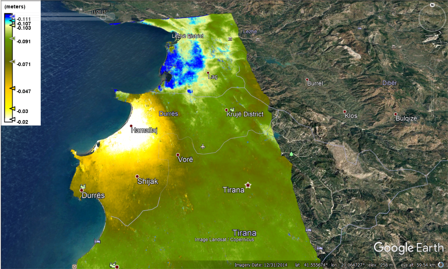
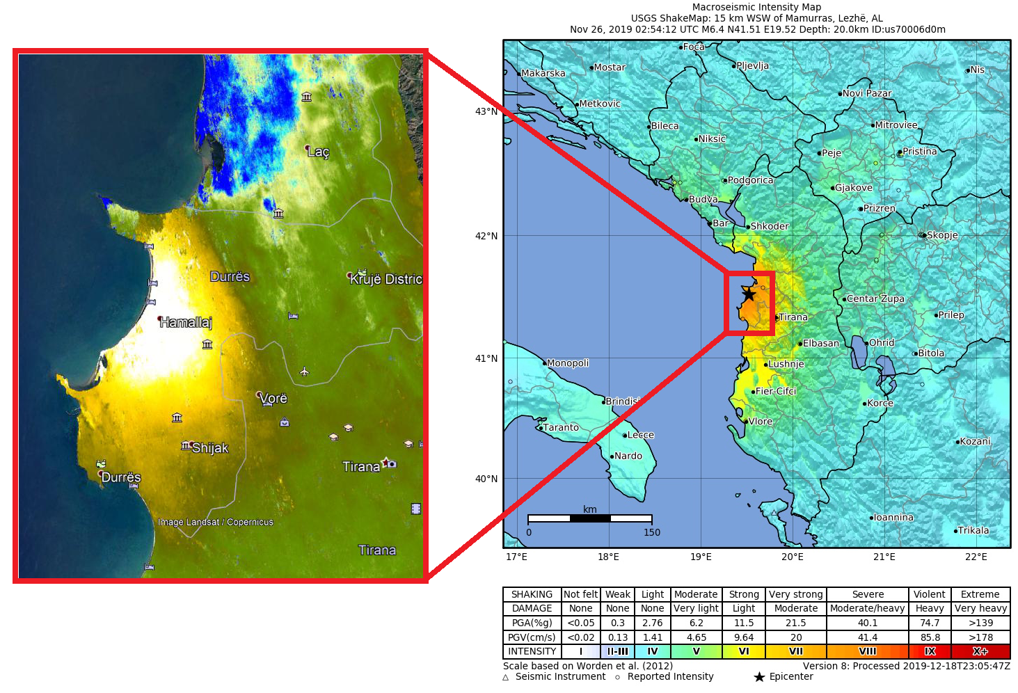
I don’t have much other information regarding this earthquake to compare this data to, but Wikipedia has a nice map showing the shaking intensity resulting from the earthquake. It compares well to the displacement data obtained here, but the epicentre seems to sit to the northeast of the region of maximum displacement (white-yellow). A little further north there’s an area that the interferometry data says dropped as a result of the earthquake, shown in blue. Knowing very little about seismology, my interpretation of this would be that the earthquake involved a movement from the northeast to the southwest: following the fault, rock moved southwest leading to a bulge in the southwest and a depression in the northeast.
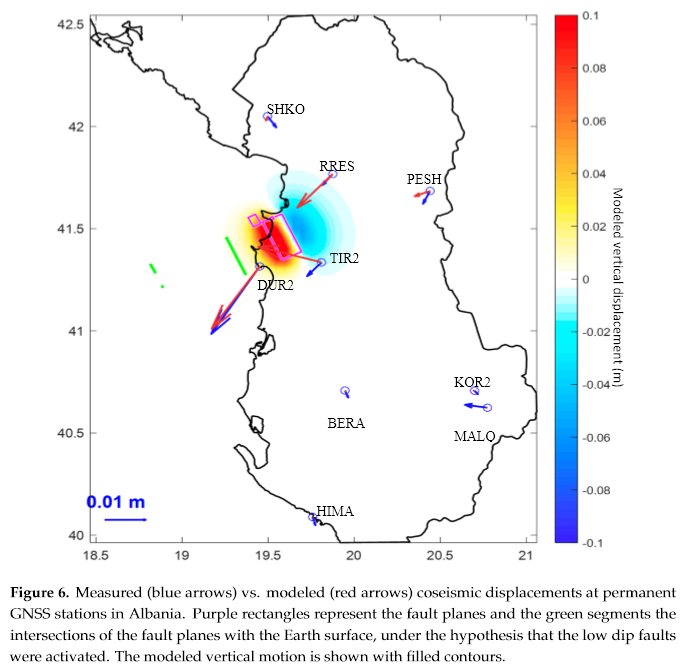
It seems that this guess is actually pretty close to the truth. An article published on studying this earthquake with Sentinel-1 data (Remote Sensing 2020, 12, 846) includes this figure showing a modelled downwards displacement to the northeast, but it looks like the patchy blue stuff in the displacement data above is an artefact rather than a real deformation. Ah well, you don’t get everything but I’m still pretty happy with how this turned out.
For anyone interested, here’s the .kmz of the displacement data.